Branding
Logo Design
Web Design
Lillooet Wild is a collaborative endeavour between Lillooet Brewing Co. and the Lillooet Naturalist Society focused on bringing awareness to Lillooet's wildlife.


Deep Dive
Project Overview
Lillooet Wild was developed as a collaborative initiative between Lillooet Brewing Co. and the Lillooet Naturalist Society, with the goal of bringing awareness to the region’s unique wildlife and ecosystem. The project required an identity that could bridge education, community, and brand partnership—something engaging enough to draw attention, but grounded enough to reflect the landscape it represents.
In addition to the logo, the project extended into broader brand direction, including the visual approach for a companion website and supporting digital assets.
A Logo Rooted in Place
The identity centers on a badge-style logo inspired by outdoor and summer camp aesthetics. This direction was intentional—it evokes exploration, learning, and a connection to nature, aligning closely with the initiative’s educational focus.
Beyond its tone, the logo was designed for versatility. It needed to perform across a range of applications, from printed materials to embroidered merchandise, without losing clarity or impact. The circular format and bold shapes ensure it remains legible and recognizable at any scale.

The shapes and colours of the logo are steeped with meaning representing the Lillooet region:
🔵 Outer blue ring: the Fraser River that runs through BC
🟡 The yellow ring represents the semi-arid desert region that Lillooet is a part of (yes, Canada has deserts!)
🟠 The orange ring represents the sun and the extreme heat Lillooet experiences in the summer
🟢 The green 'w' represents the mountains of the region
🟣 The purple point represents the valleys in which much of the space is farmland, growing crops that thrive in Lillooet's ecosystem that would otherwise have a hard time growing in Canada
Together, these elements form a cohesive mark that communicates not just wildlife, but the broader ecosystem that supports it.
The Website
I provided the general design direction for the website and it was built in WordPress by The Number Creative.
The website direction builds on the same sense of energy and accessibility. Colour plays a central role, with a bold purple background establishing an immediate visual identity. Rather than using colour sparingly, the system embraces it—applying different tones contextually across pages to create a dynamic and engaging experience.
This approach reinforces the educational aspect of the initiative, making the content feel approachable and visually stimulating, particularly for a broad audience.


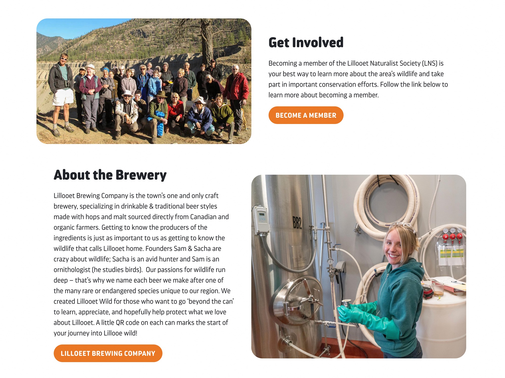
Bridging Two Brands
A key consideration within the project was maintaining a connection between Lillooet Wild and Lillooet Brewing Co. This is most evident in the wildlife compendium, which incorporates illustration assets from the brewery’s existing library.
This crossover creates a subtle but effective link between the two, allowing users to engage with the educational content while building familiarity with the brewery’s visual language. Interactive elements, such as animal population maps, further enhance this experience by adding depth and utility to the content.


Supporting Content and Expansion
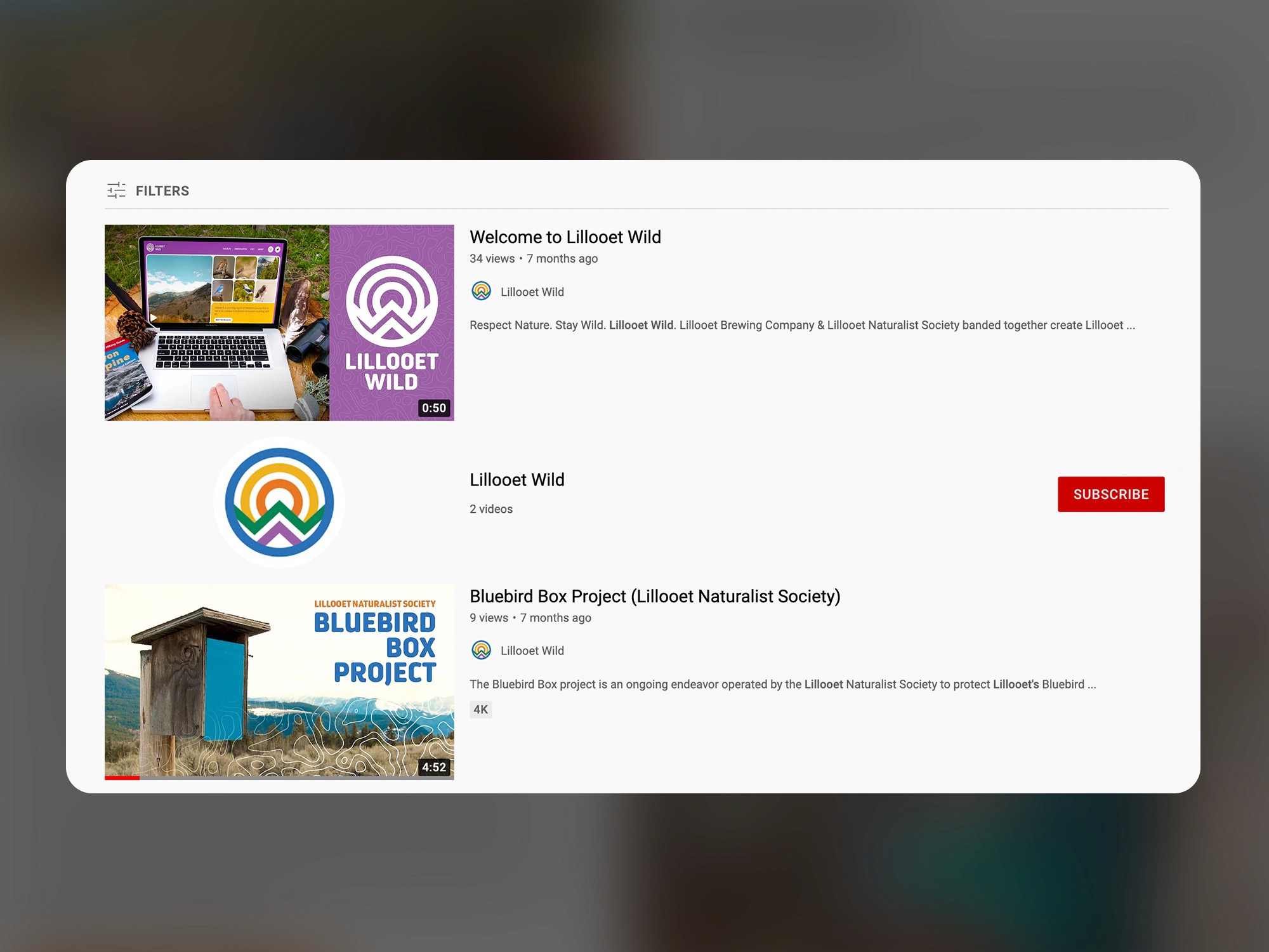
Additional assets, including YouTube thumbnails, were designed to extend the identity into video content. While the channel itself was not fully developed post-launch, these elements demonstrate how the visual system can translate across platforms, maintaining consistency while adapting to different formats.
A Cohesive Regional Narrative
At its core, Lillooet Wild is about storytelling—using design to communicate what makes the region distinct. The identity brings together geography, climate, and wildlife into a single, cohesive system that feels both informative and engaging.
By grounding every element in the realities of the landscape, the project avoids feeling generic or overly stylized. Instead, it positions Lillooet Wild as an authentic reflection of place—one that educates, connects, and invites further exploration.