


Title
Tags
Graphic Design
Thumbnail Design
YouTube
Description
I recently got new wireless mics for my content creation journey, so I recorded an unboxing video for my YT channel. A good video needs a great thumbnail. It's like the poster for a movie—it needs to be clear, engaging and draw the viewer in.
Deep Dive
Wireless Go III Unboxing
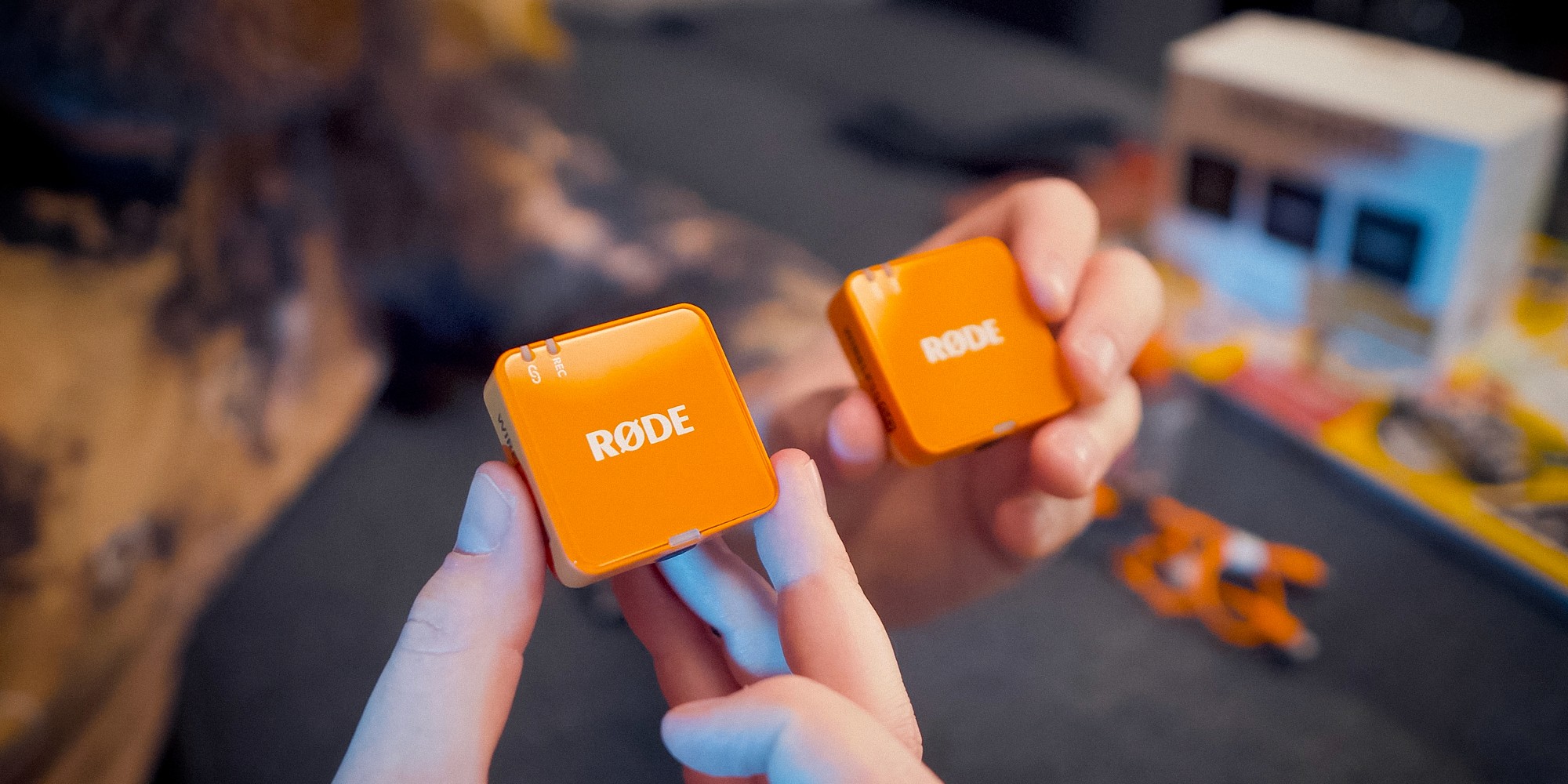
In 2025, I started my YouTube channel, Sights Set Elsewhere. I had the gear I needed to get started, but I wanted to upgrade my wireless mics. Earlier that year, I had collaborated with Fifine to review their M9 wireless microphones.
They were a great entry level solution to get me familiar with using wireless mics, but I could tell I would want to upgrade. I made a promise to myself that I could only purchase a new set if I stuck with the whole YouTube thing. After my 10th video, I purchased the Rode Wireless Go (Gen 3).
The Thumbnail — A Mini Movie Poster
After recording and editing the video, I started making the thumbnail for the video. Thumbnails are so much fun! They’re like little movie posters that act as a design sprint—one piece of graphic design to pull the viewer in. The subject needs to be clear and represent the quality of the video to make a potential viewer click and watch.
Learning From Previous Vids
The first video I posted to SSE is an unboxing of a camera bag. The Thumbnail has bold text and a clear focus on the product. So far it’s the best performing video on the channel (6.9k views as of 30 May 2026). I took notes from the success of this design and applied it to the mic thumbnail.
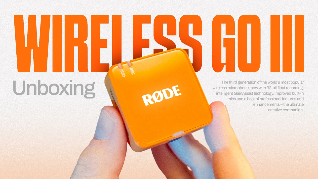
Version 1
I kept it simple—too many elements would overcomplicate the visual. YouTube Thumbnails can get quite small, so visibility at small scales is key.

The first version established the layout for the design. I liked the simplicity of the flat, graphic nature, so this is the version I initially published the video with. Schabo Condensed is the title font and I love it so much! It’s a bold, blocky sans serif with verticality that lends itself to thumbnail design. The supporting text is Archivo, one of my favourite Google fonts.
After returning to this design a bit after posting, I was curious what it would look like if I spruced it up with some elements that enhanced the design without taking away from the clarity.
Version 2
With a few subtle touches, I elevated the thumbnail design to a new level.
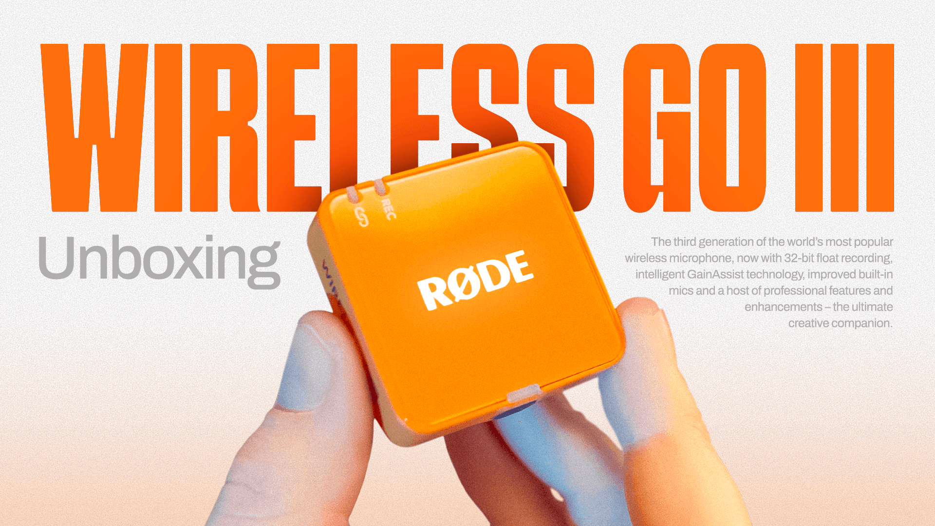
I added:
Light grey background with grain for texture
Soft orange gradient coming up from the bottom
Grain to the mic image to add texture and reduce colour banding
Shadow behind the mic on the title text for contrast to make the subject stand out
These additions add visual interest while either maintaining or elevating clarity of the subject matter.
The Video
If you want to check out the unboxing vid for yourself, here it is! Please leave a like if you enjoy the content, that goes a long way in letting boosting my video in the YouTube algorithm. Thank you!
Site
Socials
© Kyle Humber 2026