UI/UX Design
Redesign
Twitch is essentially an exponentially large number of directories smooshed together into a single website. This results in a very info-dense, cramped UI. Not only is it quite busy, it doesn't follow a unified design language—I set out to fix that.
Deep Dive
Project Overview
This project explores a UI redesign for Twitch, driven by a simple observation: while the platform is powerful and content-rich, the interface often feels dense and visually overwhelming. The goal was not to reinvent Twitch, but to refine its core experience—making it more intuitive, more readable, and ultimately more enjoyable to navigate on a daily basis.
The approach focuses on clarity and consistency, rethinking how information is structured and presented without losing the immediacy that defines live streaming.
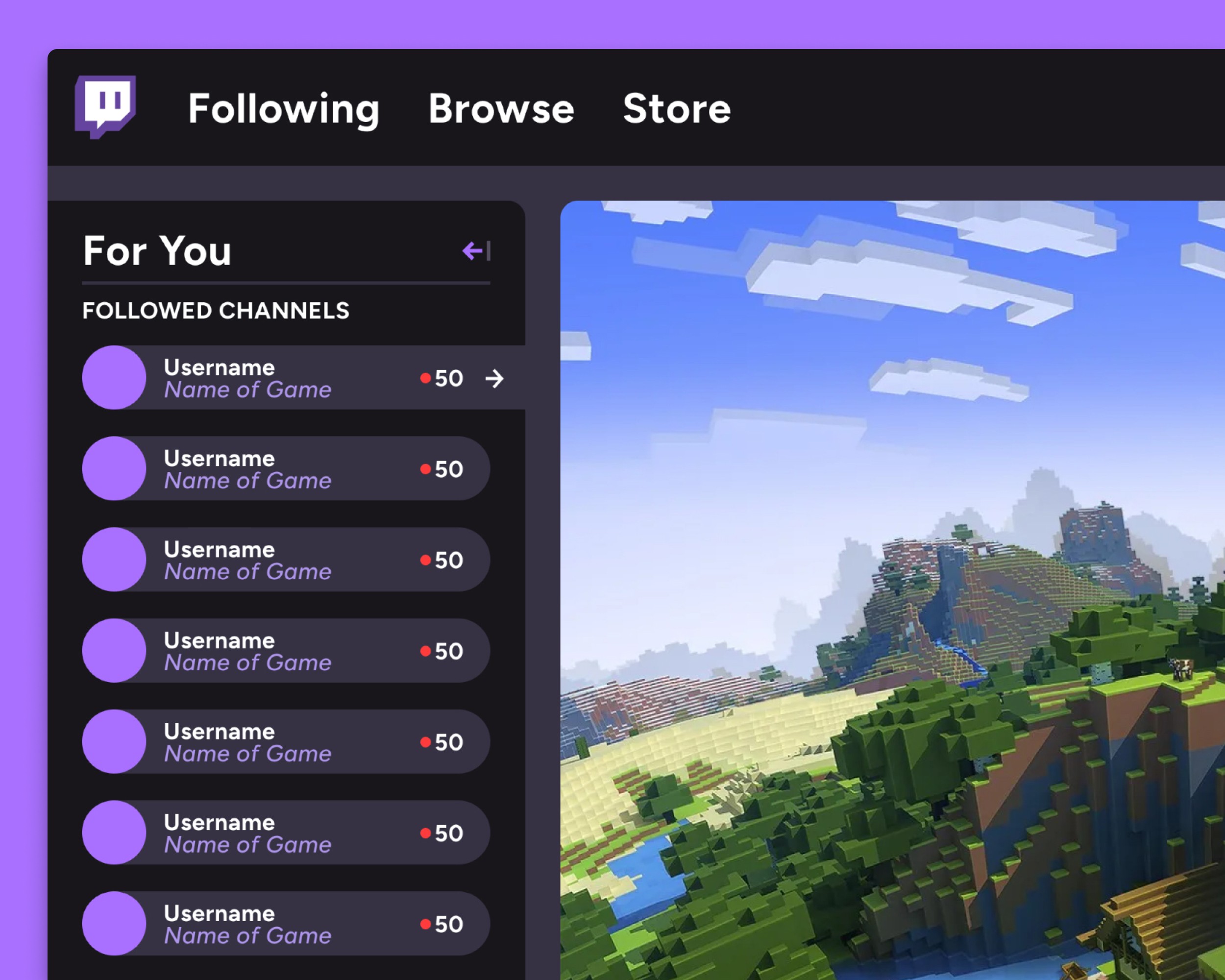
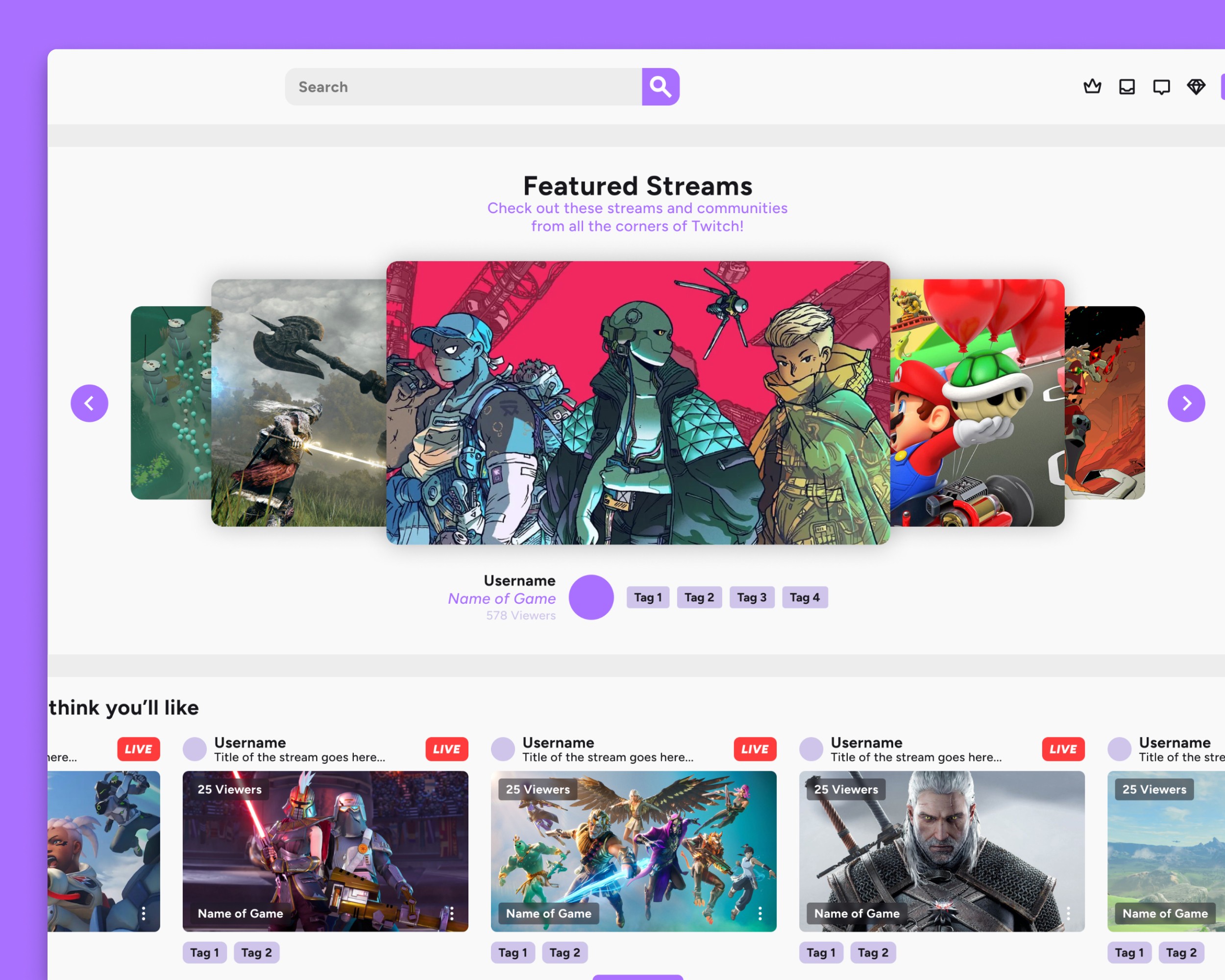
Bringing Clarity to the Entry Point
The homepage hero is one of the most important moments in the experience, yet it lacks clear framing. By introducing a defined “Featured Streams” label and improving spacing, the section becomes more understandable at a glance. Users are no longer left to interpret what they’re seeing—the hierarchy does that work for them.
This small shift turns the hero from a passive content block into an intentional starting point, setting the tone for the rest of the browsing experience.

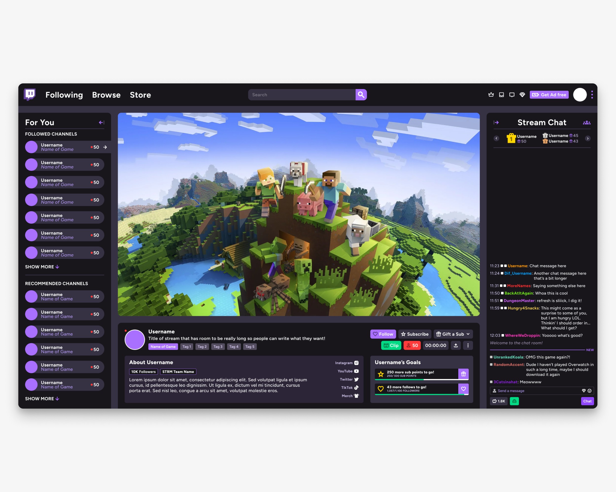
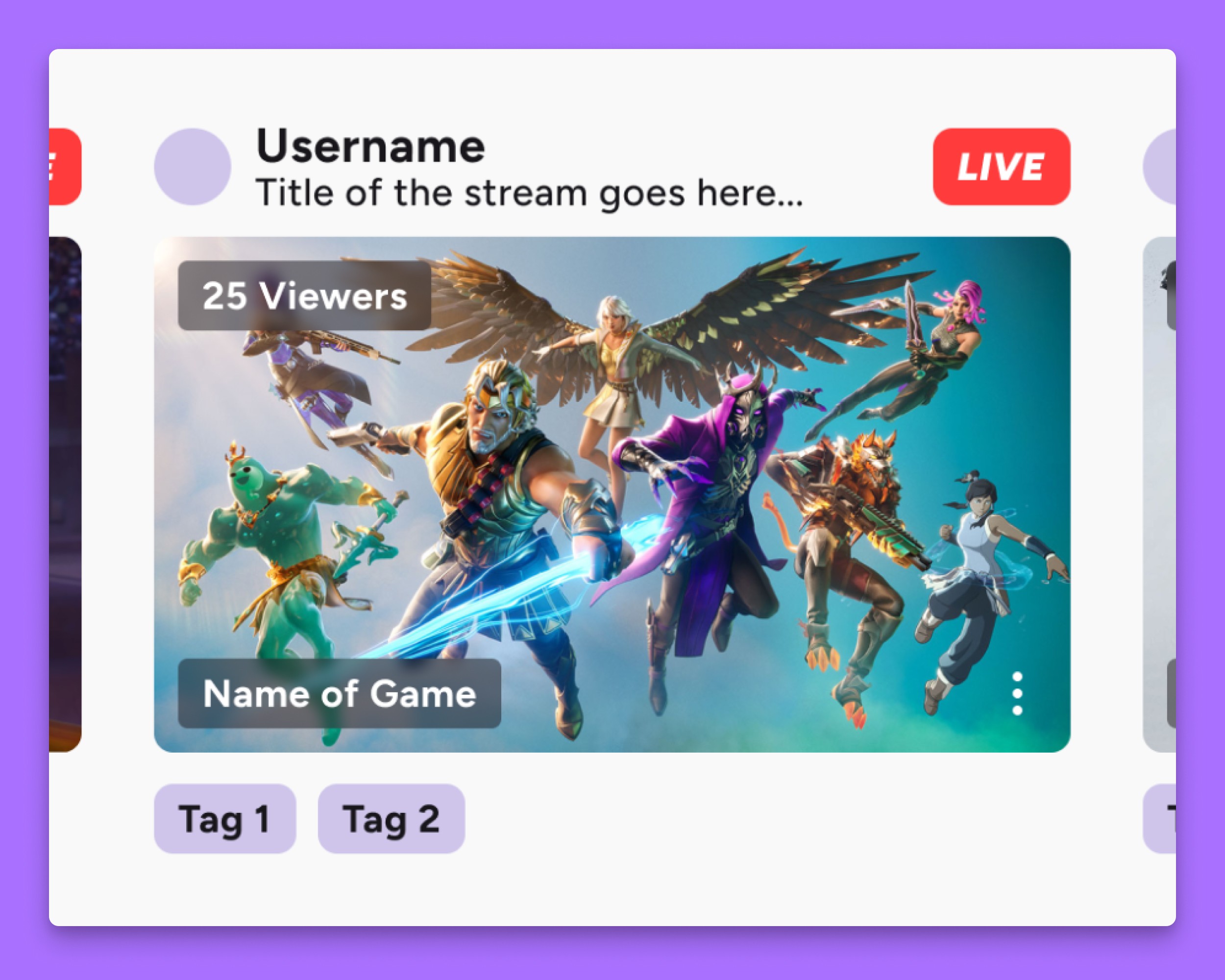
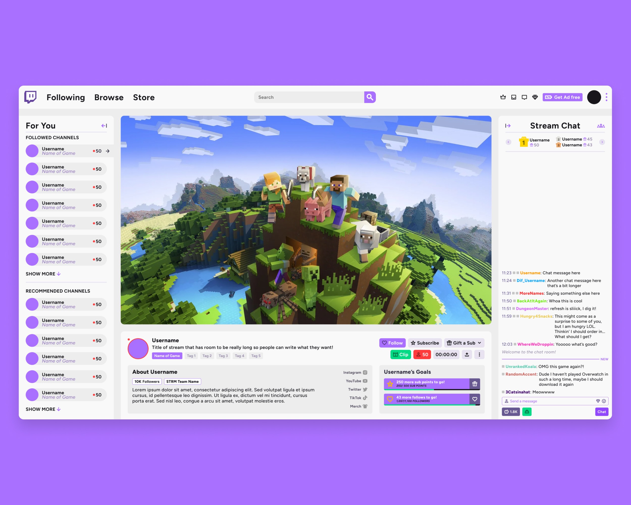
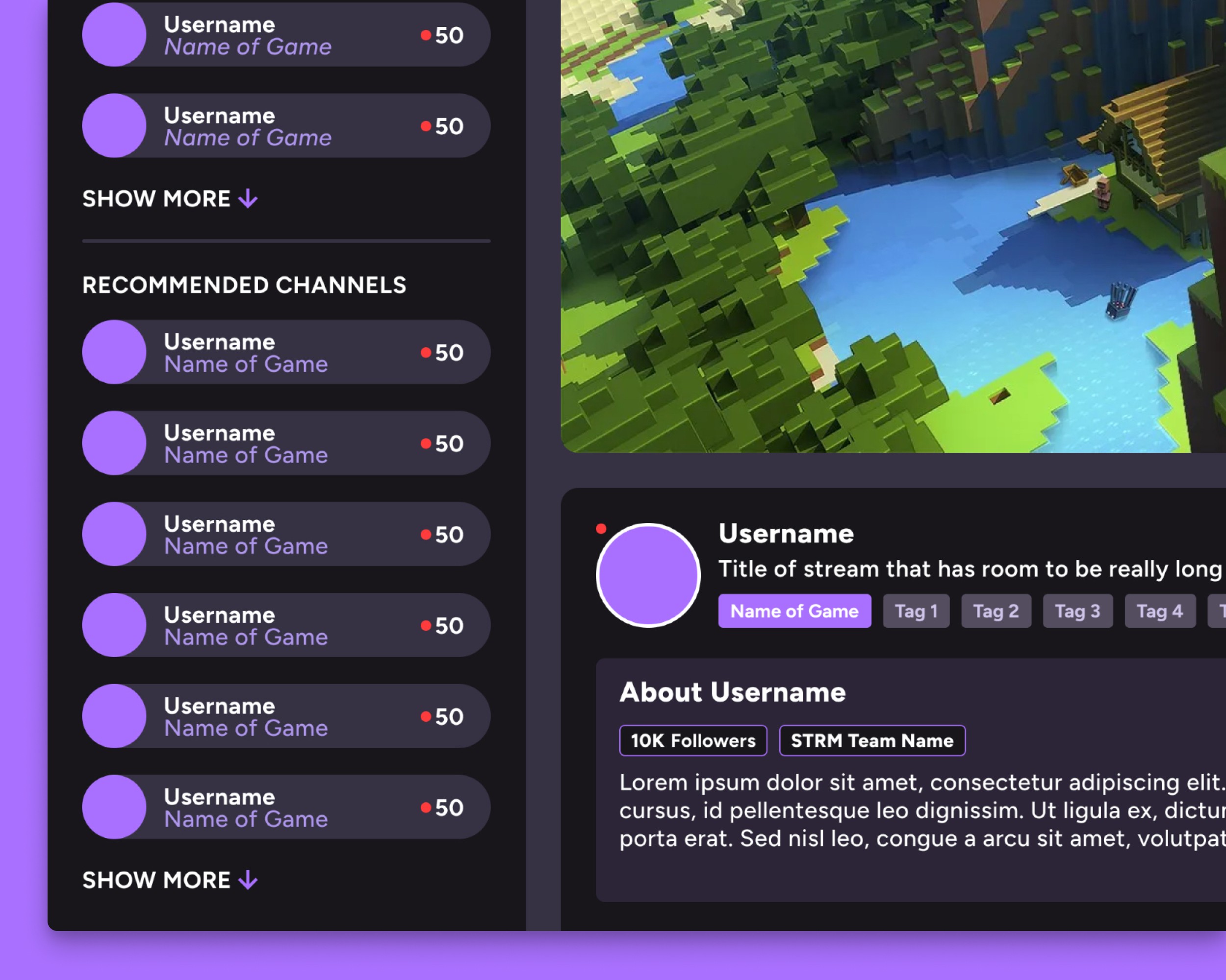
Reworking the Core Unit
Stream cards are the backbone of Twitch, appearing across nearly every surface of the platform. They carry a significant amount of information—stream title, creator, category, viewer count—and need to function both individually and at scale.
The redesign prioritizes balance. Visual hierarchy is tightened so that key details surface quickly, while secondary information recedes without being removed. The result is a card that feels lighter and more scannable, whether viewed in isolation or as part of a larger grid.

Creating Space Through Separation
One of the primary sources of friction in the current experience is how tightly packed the interface feels. To address this, the stream page introduces floating sections that break the layout into distinct, digestible areas.
This separation creates natural breathing room, reducing cognitive load and allowing users to focus on one type of information at a time. Containers are used more deliberately, giving structure to content while subtly guiding the eye through the page. The overall effect is calmer, without sacrificing functionality.

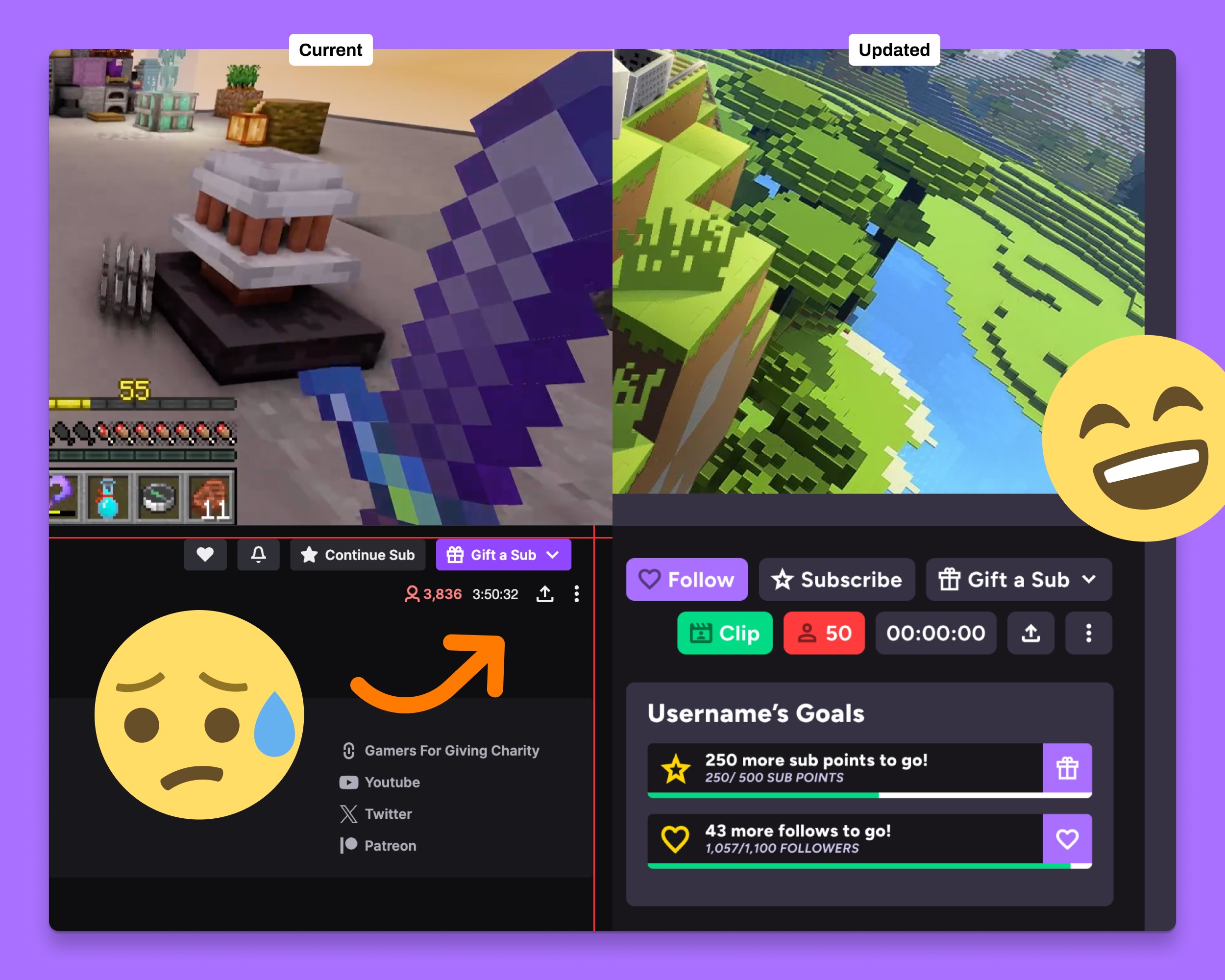
Restoring Consistency Across the Interface
As Twitch has evolved, different features have been introduced with varying design treatments, leading to inconsistencies—particularly in high-density areas like the stream information panel.
The redesign brings these elements back into alignment through a unified system. Information is organized into consistent rows, each treated with the same visual logic, creating a stacked, modular feel. This not only improves readability but also reinforces predictability, helping users quickly understand where to find key details.

Designing for Dynamic Content
Twitch is inherently dynamic. Viewer counts change in real time, stream durations update continuously, and interaction states shift depending on whether a user follows or subscribes to a channel.
The updated layout accounts for this variability by creating flexible containers that can adapt without breaking structure. Key actions, such as following, subscribing, or clipping moments, are given clearer placement and hierarchy, making them easier to access in context. The introduction of a dedicated clip action, for example, lowers the barrier to capturing and sharing moments as they happen.
A More Navigable Experience
Taken together, these changes reposition the interface from dense and reactive to structured and intentional. The redesign doesn’t remove information—it organizes it. By introducing clearer hierarchy, consistent patterns, and more thoughtful spacing, the experience becomes easier to navigate without losing the energy that defines the platform.
It’s a refinement of the everyday experience—making Twitch feel less like a wall of content, and more like a system designed to help users find, watch, and engage with streams effortlessly.
