

Hop Journal
HOOH wanted to add a blog to their website to share hop research and insights. With the scientific angle of the blog, I pitched the name Hop Journal to elevate the articles from blog posts to be more in line with scientific journals. I developed a simple HJ logo for the blog, pulling inspiration from the likes of Huffinton Post.

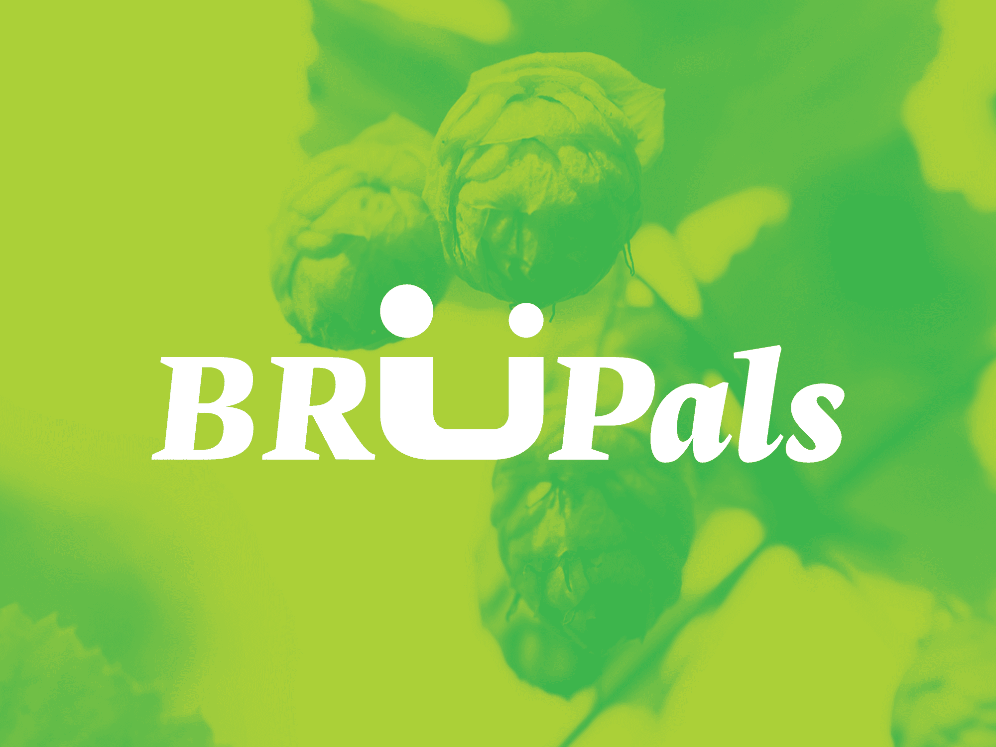
BruPals
In addition to the blog, HOOH had the idea of potentially starting a podcast to talk to brewers and people in the hop industry to gather their insights and discuss all things hop-related. While hops are used in a variety of ways, they are mainly used in the beer brewing process—considering that would be a lot of the talent on the podcast, I looked to brewing for inspiration.
I came up with the name BruPals, focusing in on the friendly tone and sense of connection. Turning "Brew" into "Bru", I changed the "U" to a bespoke design with an umlaut. Not only does this reference German brewing heritage, it creates two figures that are connected as well as a quirky smiley face. It could work as the full wordmark or just as the "U" icon.

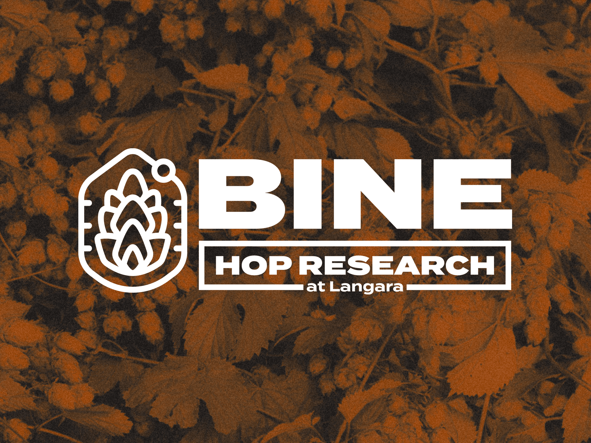
BINE Hop Research
HOOH teamed up with Langara University to create a research team to study hops. They wanted a name and logo for this collaborative endeavour, so I picked BINE as it directly references what hops grow on (nope, not vines, bines). The logo incorporates multiple elements emphasizing the research aspect.

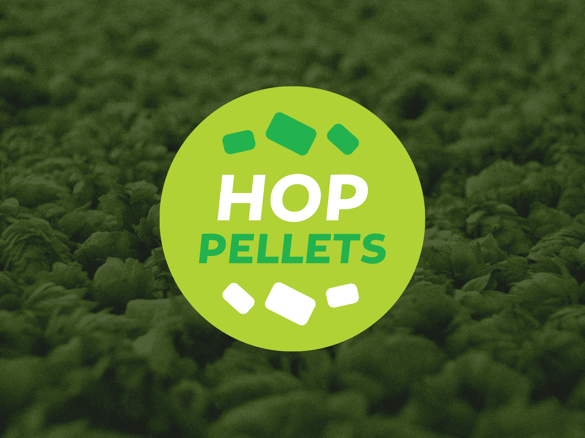
Hop Pellets
Hops can be prepared and packaged in various forms, but pelletizing them is a standard method. I designed a sticker to be placed on packaged products.
