Fotografisk – Framer Template (WIP)

The Project
One of my hobbies I have loved for years is photography! From getting out with my camera on a trip to editing a batch of photos on my laptop while kicking back on the couch, I love the whole process.
I have wanted to find a home for my photography that isn't just Instagram, but I never came across a site template that spoke to me. So I decided to build my own photography site. Inspired by my Danish heritage, I have named the site after the Danish word for photography: Fotografisk.
Note: This site is a work in progress. This is a project I work on occasionally in my free time, and there are features I am still waiting on Framer to release in order to complete my vision for the site. More details on that below.
Shaking Things Up
In my search for a photo site (and even pulling inspo for building this one), I was disappointed with how many sites were just bland and devoid of character. I want something bold and unique that I could also potentially turn into a template and put on the Framer marketplace.
I set forward with the focus of making a photography site that stands out from the crowd by fulfilling my own wants and needs.
Aiming for the Basic Plan
With this being a hobby site to house my photography, I don't want to pay an arm and a leg to get a pro plan for the site. Instead, I am building Fotografisk to fit the Basic plan, taking full advantage of the two CMS collections available (as of 27 July 2025).
The first is for the photo albums (duh)! The second is for a blog! Being able to write more in-depth about trips and photography-related stuff is a nice way to share stories and even expand upon certain albums without overwhelming the album page with text.
With Framer's CMS cross-referencing functionality, it will be easy to link blogs and albums to each other for an intuitive, integrated experience.
The Homepage
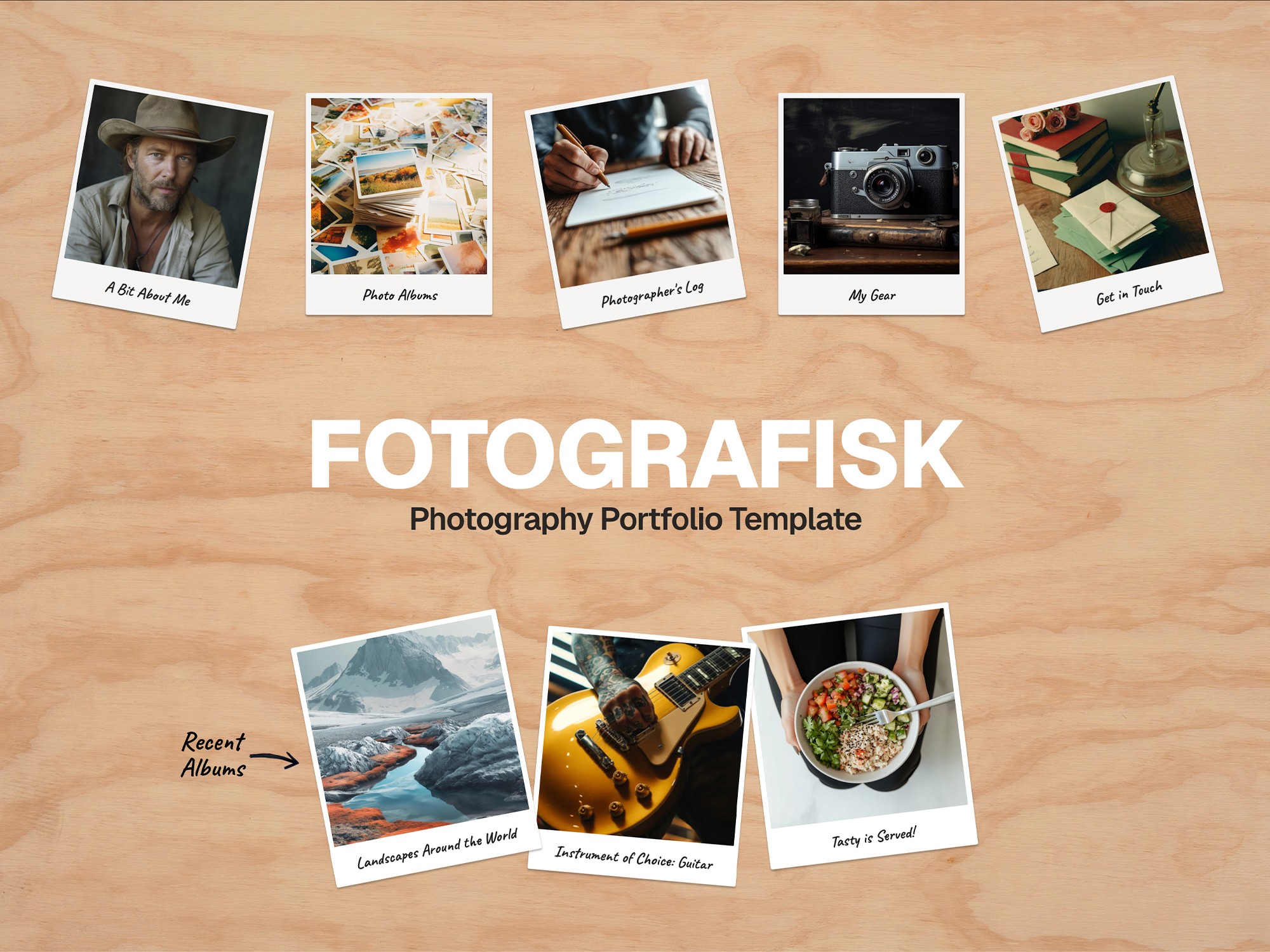
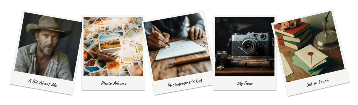
So many homepages of photo sites I visited were quite uninspiring, so I went in the complete opposite direction and made something I had never seen before. Instead of a homepage that scrolls on, I wanted something that was more of a home base that allows you to jump right into the content you want to see.
It essentially became a tabletop with photos laid out as if you were looking through a collection. The typical navigation is replaced by a row of polaroids that reacts to you hovering over each one. The recent albums below updates dynamically with the 3 most recent CMS items, keeping the homepage updated without you having to do a thing!
The background a light plywood, capturing some DIY/workshop vibes. It can be swapped out to match your personal preference.
Scrolling down reveals the footer with more traditional site navigation along with a links and contact section.
Flipping the Theme + an Interesting Nav Bar
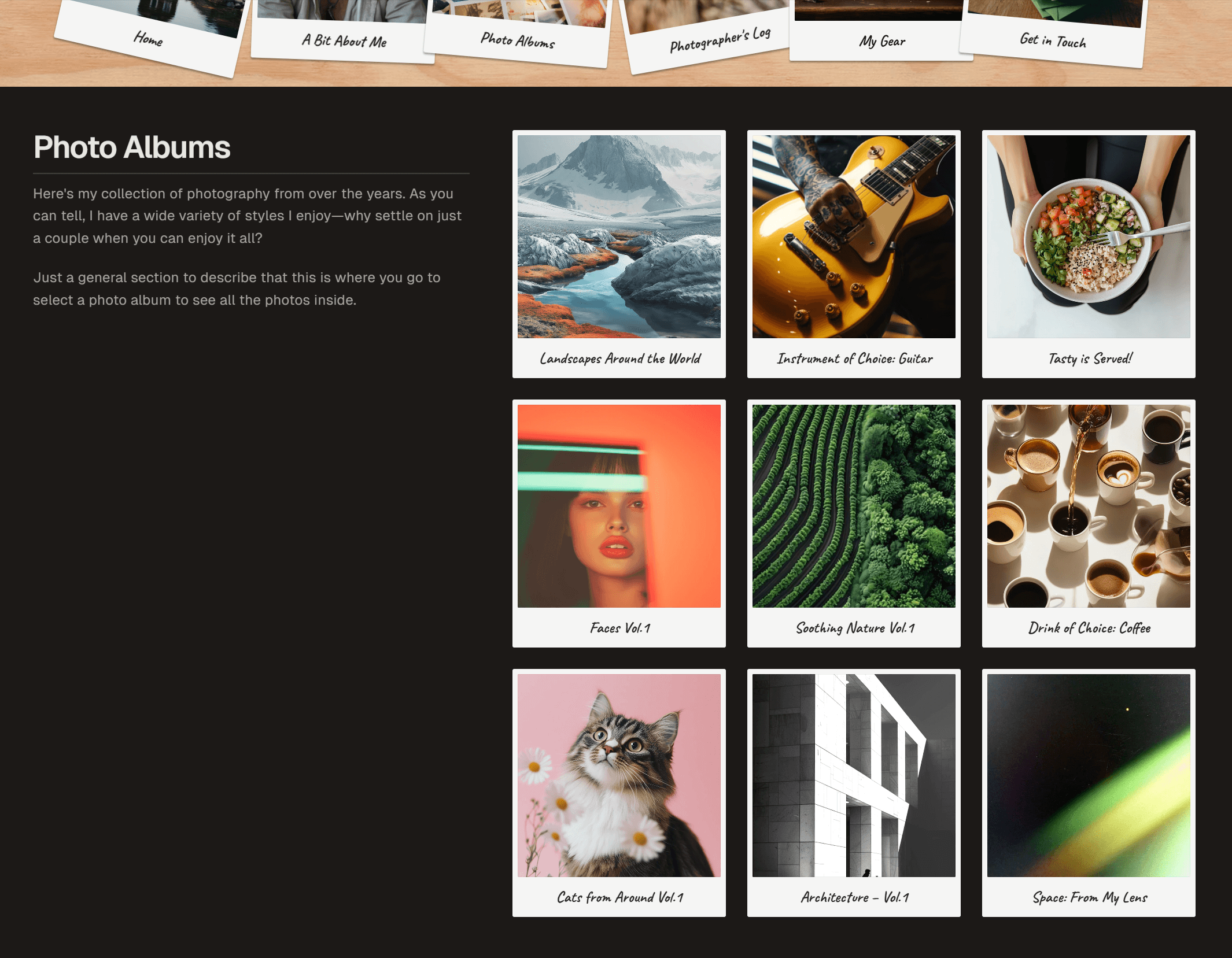
Jumping into the photo albums page, the polaroid theme continues with each image being the cover for that album.
The background is dark to allow for legible text—the plywood texture moves into the header and footer, flipping the arrangement from the homepage.
But looking at the header it's… a bit crowded? The 'nav photos' are overlapping and blocking some of the text. That all changes upon hovering over the header!
In a quick, bouncy move, the title disappears and the header expands like pulling out a drawer. The photos splay out, each one taking up their own space and are interactive just like on the home screen. There is also an additional polaroid for navigating back to home.
This element is my favourite thing about the site—I enjoy sitting on a page and just playing with the animation 😆.
Photo Albums
Diving into one of the photo albums, you are met with a lefthand column with the album info and the photography in the righthand column. As you scroll down to see more, the description stays in the top left corner for easy reference at any point.
The gallery aspect is the main area I am waiting for Framer to add more functionality. Right now, the gallery images have to be the same aspect ratio—any other ratio will be cropped to fill the set size. I need Framer introduce a masonry grid option so that photos of all sizes can fit into the gallery grid. I also want the functionality of full screen lightboxes with navigation controls for taking advantage of the screen real estate to view images 1-by-1.

I know there are code overrides and custom components—I've even tried building one with Framer's Workshop plugin. However, it is not currently able to build a custom component that can reference a CMS gallery, so adding in that functionality is on hold until Framer adds it as a feature or lets me build it myself.
The Gear Page
I love me some organized info, so I find this gear page super satisfying (I am designing it for me after all)! The initial plan was to make the gear a CMS collection, but the photo albums and blogs took precedence for the 2 CMS collections in the basic plan. My workaround was to make a component that made it easy for the user add their gear into the sections easily.

The component has fields to fill out all the info and populate it on the page, and it's built to fit all breakpoints too! All the user has to do is duplicate an existing item and replace the info in the sidebar and boom! They've got a built-out gear page that is responsive for desktop, tablet and mobile.
Things to be Done
There is still quite a bit to be done with the site, so here is a breakdown of what I will be tackling in the future:
Optimize existing pages for tablet & mobile (some are just built for desktop rn)
Create in blog CMS, index page and detail page template
Create Contact page
Add cross-reference functionality to photo album & blog CMS, add to detail page templates
Make more components for about page layout
+more stuff I'm not thinking of 😆